In the Weeds: Time Series Analysis
What can time series data tell me about my cycling fitness?


In my previous posts about endurance fitness indicators, I focused on summary statistics, which keep things simple but can also get a little boring. The more I ride, the less interesting these graphs become—even if they do indicate potentially interesting trends.
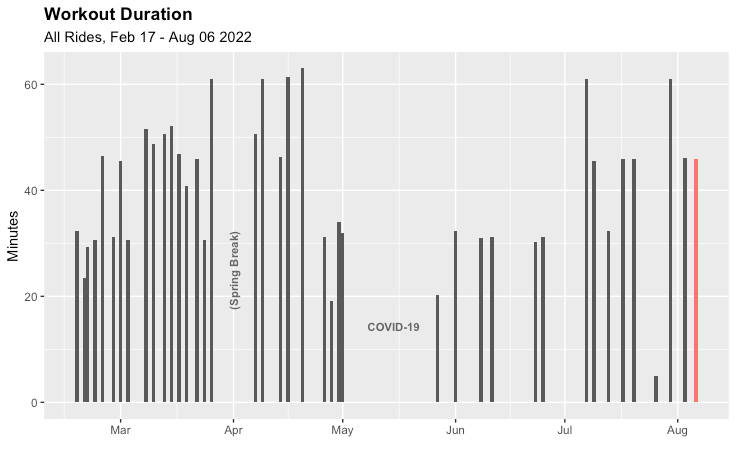
Unlike weightlifting, cycling generates time series data, which can paint a more detailed picture of each workout. So after I finished a ride this weekend, I dove into my time series data to answer the question: How did that ride compare to my other rides—not just in aggregate, but moment-by-moment?
To answer this question, I needed to figure out what the time series of an average ride looked like. I used the dplyr package in R to take a point-by-point median of heart rate and power across all of my rides (since I bought my spin bike earlier this year). R makes this sort of analysis easy. I created my median ride with a single line of code:
medianRide <- selectData %>% group_by(row_id) %>%
summarize(median_power = median(power, na.rm = TRUE),
median_HR = median(heart_rate, na.rm = TRUE),
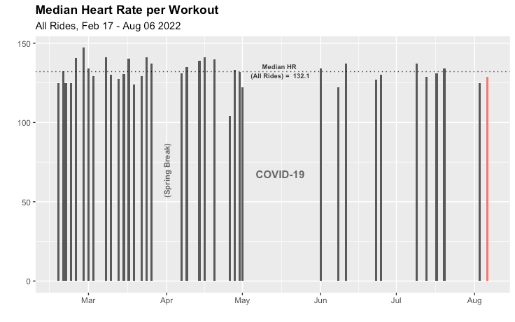
n = n())With my "median ride" in place, I plotted my most recent ride against it. First, let's look at my heart rate.
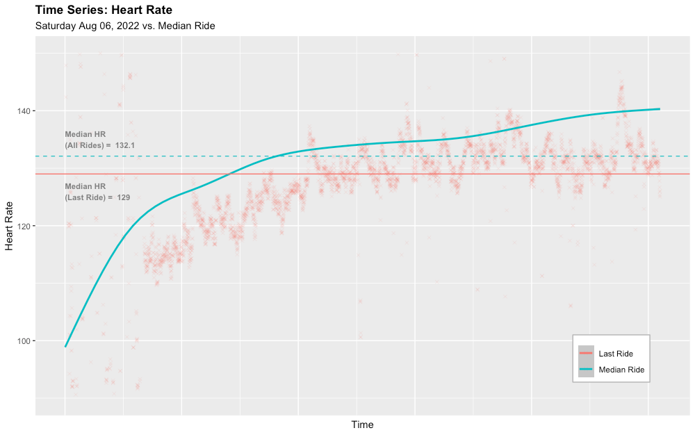
A few things jump out from this graph:
- My heart rate monitor wasn't working for the first few minutes (oops).
- Heart rate for this workout was below average rate for the entire ride.
- My heart rate drifts up throughout the ride, a phenomenon called cardiac drift.
These observations don't point to definitive conclusions about performance or fitness. Was my heart rate below average because it's getting more efficient, or because I wasn't working as hard? To get a sense of which is more accurate, let's look at power.
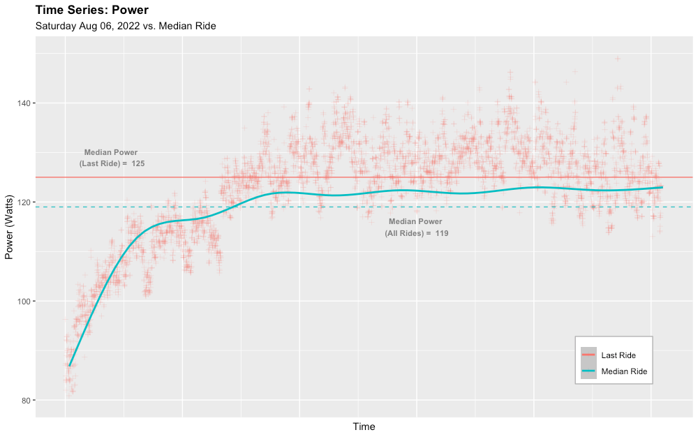
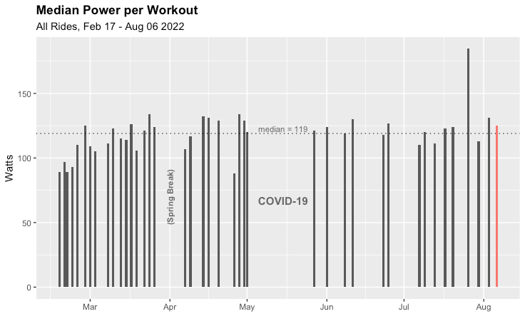
Looking at power:
- After warming up, power is consistently above average for most of the ride.
- After warmup, both "median ride" power and this ride's power hold more constant than heart rate.
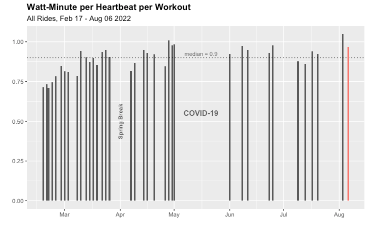
The fitness metric I previously wrote about is simply the ratio of these last two metrics (power and heart rate), which tells us the amount of energy (measured in watt-minutes) I'm able to apply to the pedals with each heartbeat.
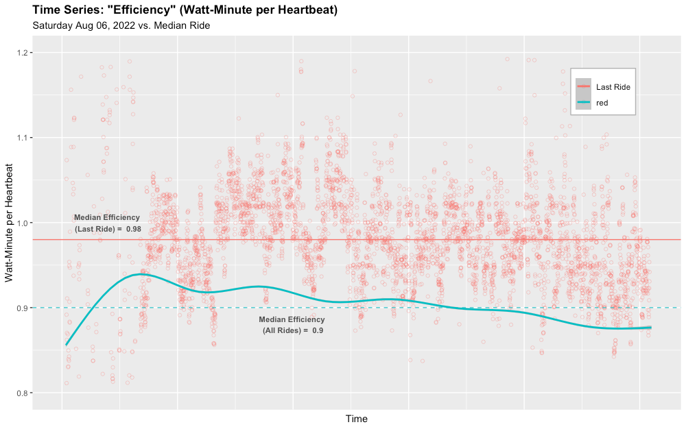
Like power, this metric is above average for most of the ride. But since heart rate (the denominator of this metric) drifts up throughout the ride, this metric declines. Two things seem to be happening:
- The "above average" characteristic indicates that my heart was more efficient in this ride than in my average ride (an indicator of increasing fitness).
- But within all of my rides (my average and this ride specifically), I tend to become less efficient at generating power as the ride progresses. My heart rate has to increase to maintain power.
The second point above can only be revealed with a time series analysis, as opposed to looking at averages. Of course, I might be able to describe the rate of decline in watt-minute-per-heartbeat with a new summary statistic, but that's an analysis I'll have to tackle another day.