It's Nice to be a Novice: Using Data to Identify Endurance Gains
I recently decided that some endurance training would be good for me. It’s been fun to experience novice training gains.


I recently decided that some endurance training would be good for me, so I bought a used spin bike and started riding on non-lifting days. It’s been fun to be a novice at something again and experience novice gains. One difference, though, between strength and endurance training is the ease with which novice improvement can be measured.
As I mentioned in my last post, strength gains are unambiguous: If you lift more weight than you've ever lifted before, there' a very good chance you are getting stronger. With endurance training, it can be less clear. What's the difference between your first and fifth 30-minute ride in Zone 2? Your rate of perceived exertion? Perhaps, but I'd love to see something more objective. So I decided to review my cycling data in search of objective indications of improvement.
Zone 2 Training: Low and Slow
I’ve been following the advice of Peter Atia, who stresses the importance of Zone 2 training for health and longevity. Without getting bogged down in Zone definitions, this is essentially low-intensity, steady state training, the goal of which is actually to train the mitochondria. I try to ride for at least 30 minutes, but sometimes as much as an hour. I had been doing a decent job increasing my workout duration until pretty recently.
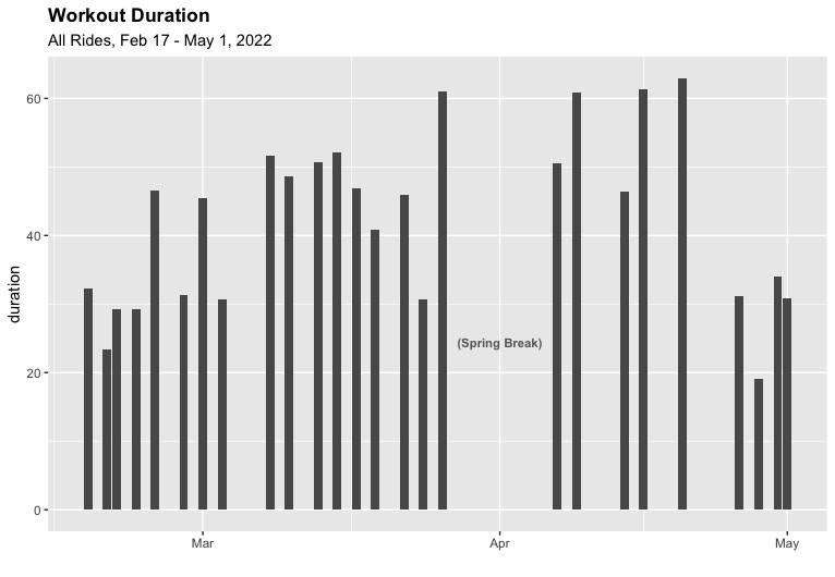
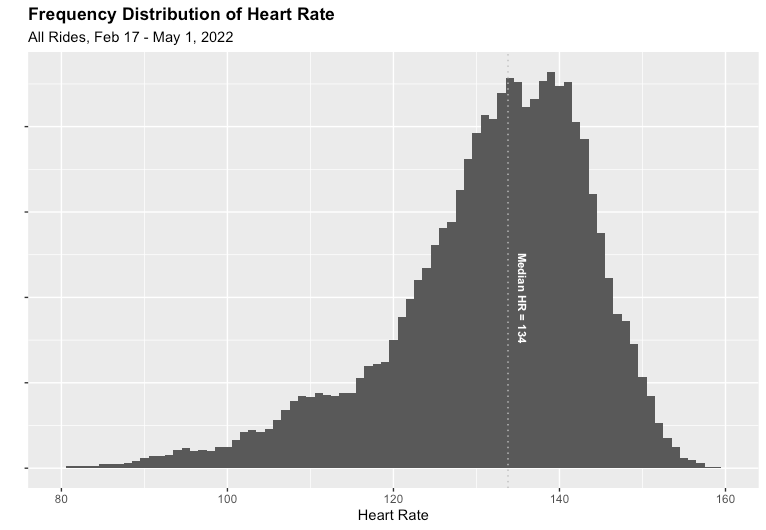
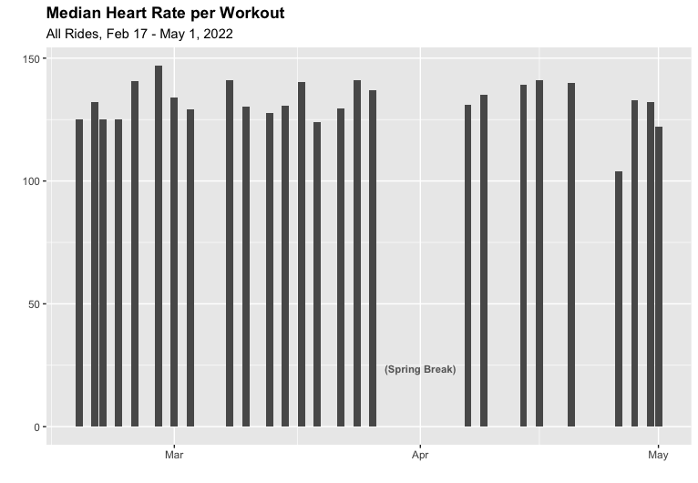
While I'm riding, I try to target a heart rate of 135-145 as my Zone 2, which is pretty clear from the histogram below. Incidentally, one of the fun aspects of analyzing cycling data is the fact you have not just summary statistics (duration, distance, etc.), but also times series data, which tell you what happened within each workout, and make for some fun charts.
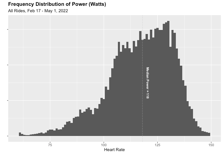
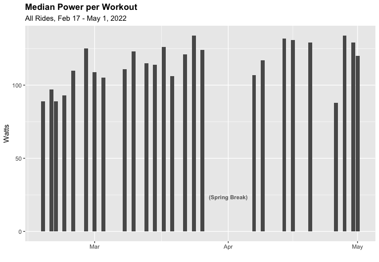
Targeting a heart rate of 135-145 yields a pretty modest power output in the low 100s. One interesting facet of this data is that it seems to be much more spread out than my heart rate distribution. Later in this post, we'll begin to understand why.
Early on in my cycling, I began to wonder how well-correlated heart rate and power were. It seemed intuitive enough: my heart works harder, and my output increases, right? Here's a fun graph that takes the two frequency distributions above and plots them against each other, which gives us a visual sense of correlation.
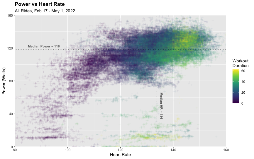
There does appear to be a positive correlation between power and heart rate, with the cloud of data points sloping up and to the right. I've also colored the data by elapsed workout time, as I've noticed that my heart rate tends to drift up as the workout progresses (this is a phenomenon called cardiac drift). You can see that most of my high-heart-rate and high-power moments occur towards the ends of workouts (green and yellow points). I plan to have some fun building models with this data soon, but for now, let's return to the question at hand: Am I getting fitter?
Fitness Indicators
Staying with the relationship between power and heart rate, I've been wondering whether my body has become more efficient at generating power at a given heart rate. This change—were it happening— could be due to many factors including:
- A stronger heart that pumped more volume with each beat.
- Increased capacity to deliver oxygen to the muscles by increasing the number and density of mitochondria, among other factors.1
- My legs more efficiently transferring force to the pedals and crank (i.e., form).
But before we get fancy, let's look at some basic trends. First, my average heart rate per ride. Looks pretty stable (as we saw in the histogram above).
What about my average power during each ride? Interestingly, this one shows a more distinct upward trend. These bars look like novice gains to me.
To dig a bit further, we can look at the ratio between the preceding two metrics (Power and Heart Rate). The units for this ratio would be "Watts per Beats per Minute" or more helpfully, Watt-Minutes per Heartbeat. In other words, how much power output is each beat of my heart yielding?
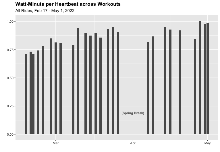
Looking at a trend of this ratio across workouts, we see an upward trend, and one that perhaps has an even more steady increase than the simple view of median power per ride above. More importantly, this ratio makes intuitive sense as something that actually tracks my fitness: The power of each heartbeat.
Metrics that Motivate
Especially since my objective for this training is to keep my heart rate in Zone 2, this ratio is likely the metric that I'll want to move over time. While maintaining a low heart rate, how much power can I generate consistently over longer and longer rides? Peter Atia typically wants his clients to sustain a Zone 2 effort of 3 Watts/kg of bodyweight. Right now, I'm holding just under 1.4 Watts/kg on a good day. Looks like I've got a long way to go, but being able to track my progress along the way will be very motivating.
Notes
- Special thanks to my friend Jeff Knight for explaining this to me, and for writing point #2.