Better Charts for Post-Novice Lifting Analysis
As training becomes more complex, how could a lifting app better visualize progress?

Every time I finish a workout, I feel like I deserve some sort of award—ideally a breakfast taco. But I live in North Carolina now, where no one has heard of such a thing. So instead of rewarding myself with food, I've been working on creating better charts and graphs of my workouts. If I can't have a taco, at least I can feast my eyes on visualization of my workouts and think "I did that."
Workout analysis charts should help post-novice lifters answer questions like:
- Am I improving?
- How did this session compare to recent sessions?
- What type of training works best for me?
Tracking Intensity: Top Sets
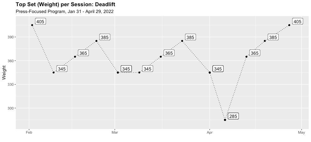
Below is the type of chart you're likely to see in many lifting apps: a simple visual of the maximum weight I deadlifted (at least once) in each session of my last complete training block. But this chart is missing a key piece of information: repetitions. How many times did I lift this weight in my "top set?"
Because rep ranges might actually be the thing you are progressing during a training block, I've always wanted to see the following chart, which shows both the max weight lifted and the number of reps (represented by point size). I've added labels to make it a little easier to read.
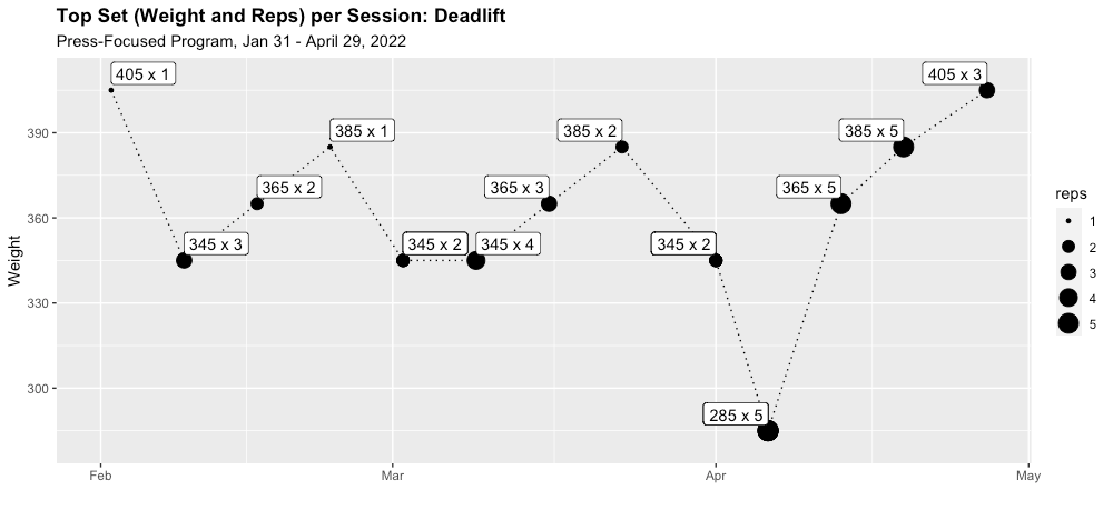
Looking at both weight and reps gives you more ways to see improvement. For example, in the first chart, my first and last workouts look identical because I lifted 405lbs in each session. But as the second chart makes clear, I lifted 405 for three reps in the last session versus only one in the first. This is a meaningful difference—and one that many apps' charts simply miss.
Now that we've seen how this top set graph can help us track improvement and get a sense of program structure, we can apply it to each of the main competition lifts. The specific list of movements might vary for different lifters, but for me it includes the squat, bench press, deadlift, and strict overhead press.
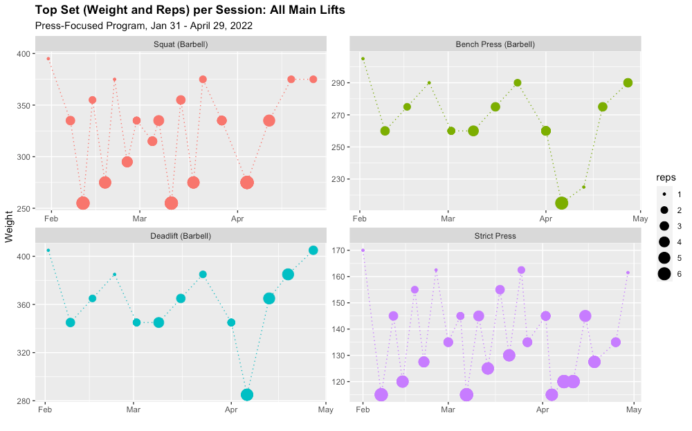
This was a good block in one sense: I was consistent. But a shoulder injury (see the lower weights at the end of the Strict Press graph) and COVID prevented me from testing my one-rep maxes at the end of the block. This was a bummer, but having these nice-looking charts at the end of the training block still gave me some small sense of achievement.
Visualizing Volume: Total Weight Lifted
Top sets are the most gratifying charts because that's where we see PRs. But volume analysis becomes important when a lifter is trying to understand why a training block worked (or didn't). Unfortunately, good volume charts are hard to come by.
Volume should be analyzed per week (or longer)
Most apps will analyze volume session-by-session, but this isn't the right frame of reference for a post-novice lifter. A post-novice is a lifter for whom progress occurs over longer periods of time. As Mark Rippetoe and Andy Baker wrote in Intermediate and Advanced Training: A Few Ideas,
As a lifter moves upward through the levels of training advancement, and as the overload event obviously becomes longer, volume is calculated across the now-longer overload event. The Novice overload event is a workout, so the volume and tonnage are calculated for the workout. Intermediate trainees are using a week's training as the overload event, and the math reflects this time period.
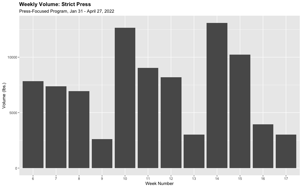
Rippetoe and Baker's piece implies that the relevant time period for analyzing volume can be a week or even longer (in the case of an advanced athlete). But a good starting point is the week. In the following chart, where volume is shown session-by-session, it's hard to discern the overall pattern of the program.
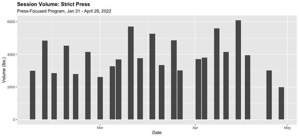
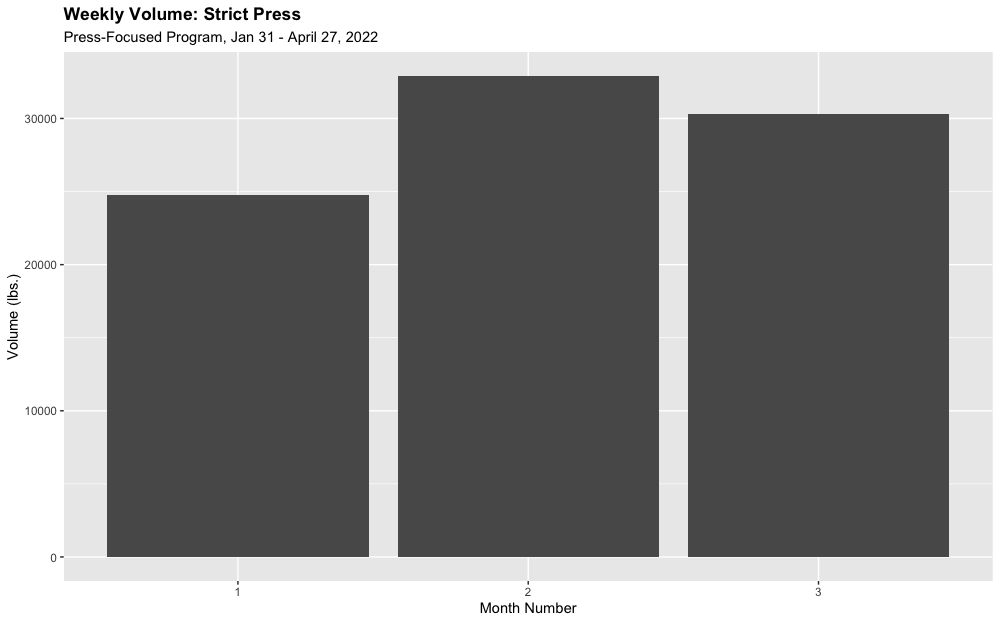
Aggregating volume by week or month makes it easier to see patterns. In the weekly chart below on the left, we can see the three mini-waves of tapering volume. Successive waves start higher than the preceding one before tapering again. However, if you look closely at the third wave, it has a different shape. Turning to the monthly chart (on the right) we can see that my volume decreased in month three. You'd think that the volume in month 3 should have continued to increase, and you'd be right. My shoulder was injured, so I skipped some sets in Week 11.
Volume charts should include variations of the main lifts
As a lifter becomes more advanced, exercise variation will increase. Incorporating a more diverse set of exercises can reduce the risk of overuse injuries and address weak points. It also makes lifting a little more fun. But exercise variation makes lifting analysis a little more challenging. Volume charts need to include all of the variations of a particular lift to accurately portray the total stress accumulation.
Below is a simple example of this. When my shoulder started bothering me during this training block, I began to incorporate squats with the safety squat bar. So when thinking about my "squat" volume during this period, what I really want to see is all of my squatting—not just my "competition squat." But typical lifting apps only track volume by single exercises.
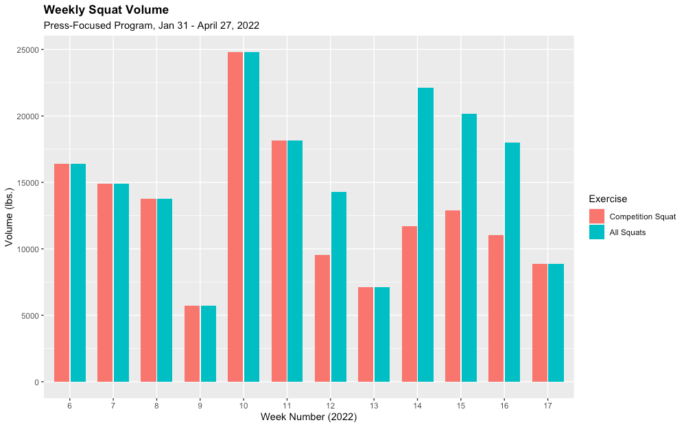
Applying this formula to all lifts (weekly total volume of all main lifts and their close variations) yields the chart below.
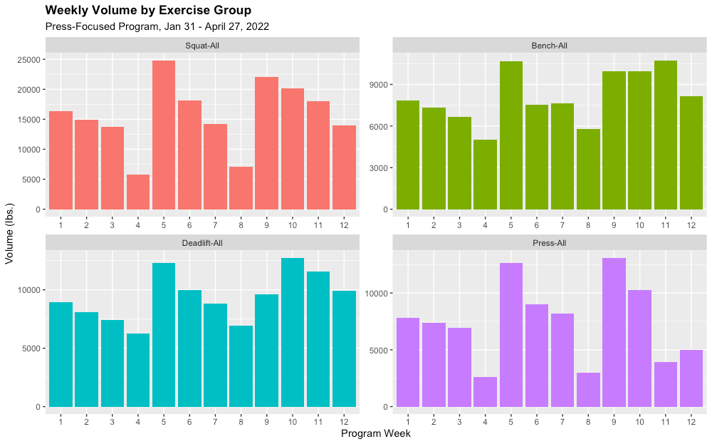
This year, I've begun conjugate training, which involves a lot of exercise variety. In fact the number of unique exercises I've tracked this year is more than double what I had done in any of the last five years of lifting. In my next lifting post, I will turn my analytical focus to the needs of conjugate lifters.
Conclusions
- Charts of top sets will show both sets and reps of the lifter's most important movements (squat, bench, and deadlift for powerlifters).
- Charts of volume will aggregate variations of movements and show them by the week or longer periods of time, based on the lifter's level of advancement.